Some time in 1988 I learned one of my biggest lessons in
aesthetics. I was living in the Los Angeles area and went to a movie theater in
Century City to see Terry Gilliam’s film, The
Adventures of Baron Munchausen. I walked away enthralled, excited, and
inspired. The next night, wanting to share my enthusiasm with my girlfriend, I
decided we should see it together. Only this time the theater was in Orange
County, and everything in the theater was automated.
Sadly, it wasn’t long before I realized that she wasn’t
enjoying herself, nor was I watching the same movie. Oh, it was the same film
all right, but it was not the crisp and brilliant projection I’d seen the night
before in Century City, the sound was muddled and dreary, and to top it all
off, the transitions between reels were choppy and an entire scene I know I saw
earlier was now missing.
I realized then that appreciation of an artist’s vision is
very much dependent on the presentation and care of others. A beautiful movie
can become a boring and tedious affair in the wrong hands. Likewise in a
gallery, the care taken by its staff is crucial in how the work looks in
relation to the space, the lighting, and didactic information (in terms of its
tone, language, and physical look on the wall). All create an atmosphere of how
a show is perceived. It is in paying attention to the details that the objects
and ideas of the artists come together as a final presentation, which we then
experience as art.
We are confronted with exactly such a problem with the
Rochester Contemporary’s current exhibition, the Upstate Invitational. Someone did not pay enough attention to those
details that would allow the work of four upstate artists to be presented in a
good light.
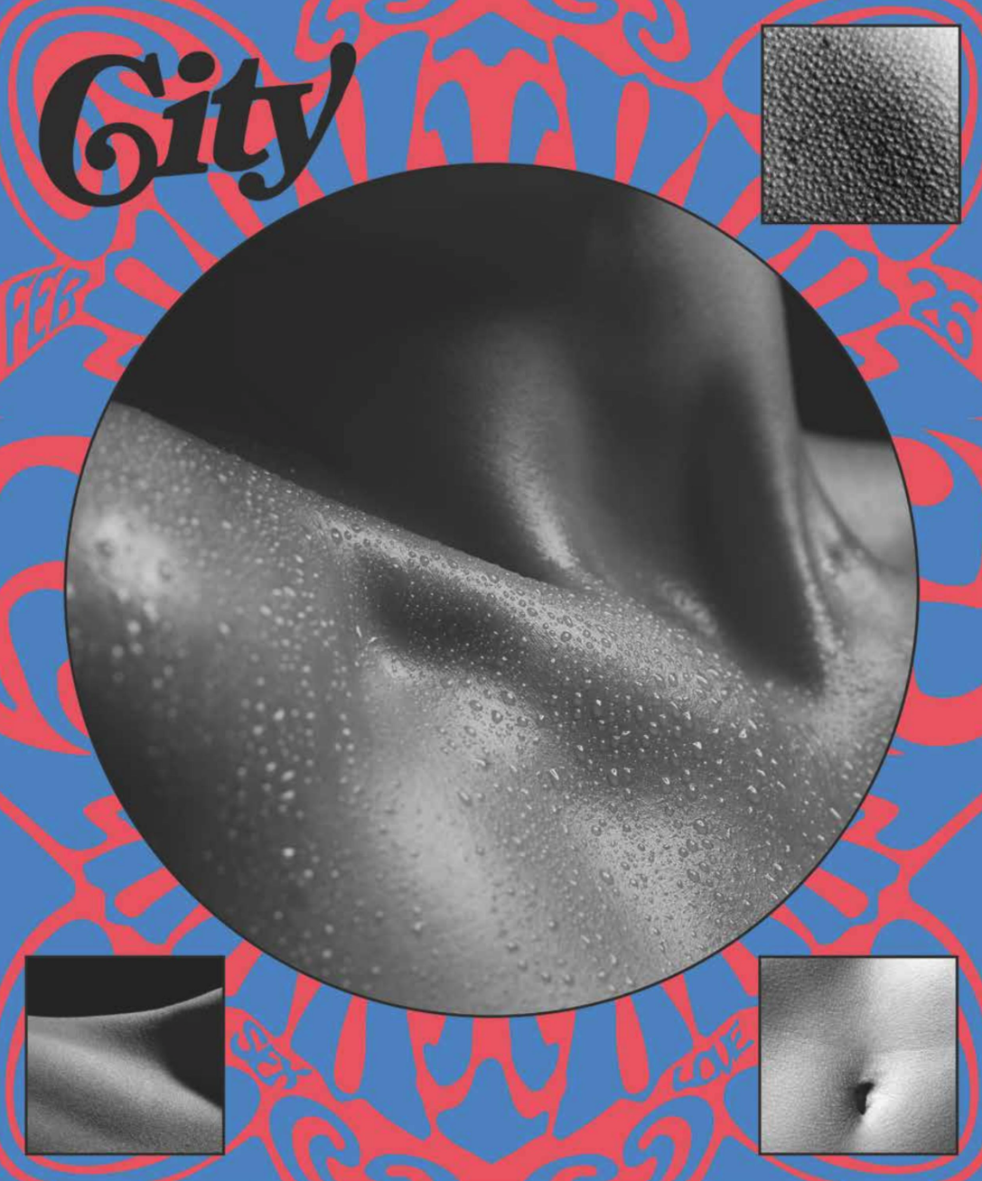
Actually, the lighting itself plays a big role in the way we
see, or don’t see, Myra Greene’s work. Her dark and complex photographs, in
which her own body lurks in and through the surfaces, are lost in the harsh
light and the reflections of the gallery itself on the Plexiglas, making it
almost impossible to really see her work — from any angle.
Paintings, however, look much better under those expensive
French lights and so the painted works of Richard Harrington and Matthew Friday
do not suffer much. They stand up to the space and hold their own.
The subtlest of the group, Greene’s work seems to have
suffered the most from egregious neglect. In addition to the lighting, a wall
statement that was literally put up on our first visit was cut unevenly and
looked like it was just slapped on with little care. On the second visit, a
week later, the same distracting, crooked wall statement was still there. Poor
Ms. Greene. We also noticed that her hinged images had begun to slightly to
tear away from the surface of the mat board, making some of them look uneven.
Where is the gallery’s responsibility in looking after an artist’s work,
noticing how it is reacting to its environment and contacting the artist if a
problem arises?
Greene’s work suffers from yet another form of neglect. The
medium was designated as “ink on paper”. In the history of art, ink on paper
refers to drawings done in ink. We knew these were not drawings, so when we
asked, we were told that the work was photographic and that an inkjet printer
printed the images. According to museum registration practices, the usual
designation for digital output is either Giclée (an Iris print) or Jet ink
print. Someone should have been a little more careful in confirming label
information before it hit the wall. There is no need for such confusion.
Ah, yes, the history of art… Matthew Friday’s work is, at
times, a fascinating reference to the history of modern painting. From
Renaissance one-point perspective to Rauschenberg’s multiplicity of sources,
Duchamp’s ready-mades, De Chirico’s enigmas, and upside-down painting possibly
referring to George Baselitz, as pseudo-social realist history painter, Friday
combines images from modern, popular culture with visual recordings of
historical events “to imagine the living wreckage of modernity.” What better
visual metaphor than a statue of Lenin being pulled down, not-so-coincidentally
echoing a similar fate of the Saddam statue in Iraq?
This pastiche of Western culture, with all its cultural and
political revolutions, ends up as a sort of bittersweet coda to Nicolas
Poussin’s Et in Arcadia Ego — a
partial reproduction of which is in Friday’s Fragments and Ruins. In other words, ideals of simplicity and
contentment can never really exist except in pictures and political rhetoric.
Matthew Gehring’s pink pieces are pretty funny stuff, mixing
a minimalist aesthetic with kitsch electronics. It’s All Good consists of a vertical 40-inch pink polystyrene bar
to which a negative ion generator and a working CPU fan make “it all good for
us.” And in Gehring’s Untitled, a
group of pink disks in three different sizes — think Carl Andre gone pink —
sits on the floor and hums from internal electronic vibrators. Maybe they’re
massaging our souls after contemplating Friday’s collapse of history and
Cartesian philosophy in his painting, Common
Misunderstanding.
Common
Misunderstanding is one of the first paintings you see when you enter the
gallery space. The words, “I think therefore I am,” are scrawled on a small
painting that is affixed to a larger one. What makes this work so interesting
is the very lack of understanding. Although the painting clearly relies on the
devices of representational painting, are we meant to understand? Hopefully
not.
Harrington, too, uses representational devices on a variety
of unexpected surfaces like floor tiles, vinyl wallpaper, and
computer-generated film negatives on an x-ray box. But his Maine-Endwell Varsity is on a more traditional surface — oil on
panels.
Childhood memories and questions of subject formation
collide on domestic and institutional materials to create interesting tensions
between form and content. In all of the images of cheerleaders, mothers, toys,
and an “Opie”-like boy named “Butch,” there is a feeling that all is not right
nor what it seems to be. This is no Mayberry.
After all is said and done, and if you get over the problems
of the sagging internal frame of the institution, the works begin to recover
somewhat and reveal themselves to the viewer. Maybe RoCo should have thought
more about going director-less and trying to curate by committee. In this case,
it just may need a director who can assume responsibility for the final
product.
Whose voice is in the wall statement that says these artists
use “a wide range of material approaches to interrogate history, identity, and
desire” and that “the committee sought well-crafted works that communicate
effectively”? Contemporary art rarely has the ability to “communicate
effectively.” Indeed, the notions of history, identity, and desire usually
create very specific and private results.
No wonder Ms. Greene chose to eschew the standard
obfuscatory statement for one, albeit crooked, that simply states, “Beauty for
me is always vibrant, mysterious, and elusive. For this project, I continue to
search for beauty in my work, and try to challenge the concept of what a
photograph can look like.”
Upstate Invitational: Friday, Gehring, Greene, and Harrington is on display at the Rochester Contemporary, 137 East Avenue, through October
17. Hours: Wednesday and Friday 1 p.m. to 6 p.m., Thursday 1 p.m. to 7 p.m.,
Saturday and Sunday 1 p.m. to 5 p.m. 585-461-2222,
www.rochestercontemporary.org.
This article appears in Oct 6-12, 2004.